 “What do you think of Windows 8?” I hear this question all the time… everywhere I go. I hear people talking about it on the bus, in line at coffee shops, and even in odd places like hospital rooms. It’s the biggest change we’ve had in the PC in well more than a decade. Everyone knows this is as big as broadband in everyone’s home.
But… more than a decade? Really?
Definitely. How old would a child be if it was born the last time there was a *true*, major version iteration of Windows? 3? 8…?
How about… 18? Yeah… 18… old enough to drive. Old enough to be looking at colleges. The Daytona (Windows NT) / Chicago (Windows 95) user experience, were it a child, would now be looking at an opportunity to suffer the choice between Romney or Obama. The experience unleashed on IT and the public introduced us to the Start menu, the Desktop, managed application installs, and several other major features that the enterprise and private user alike have now literally grown up on.
Some might argue that Windows XP was a hefty revision that almost qualifies, but I would say not so much. Improvements abounded, but the core user experience hasn’t changed by more than revision increments in Windows 98, ME, 2000, XP, 2003, 2008, 7… really… since Windows 95.
But, with Windows 8, this changes. Windows 8 brings us a whole new user experience in the “Modern UI” formerly known as “Metro UI”.
If you recall, Windows 95 still essentially lived on top of DOS, and had enough of the Windows 3.x framework to run all the apps we’d already come to depend on (like Word 6, Excel 5, and Windows AOL 2.5). While those programs ran in Chicago, there were compatibility issues, and the user interface really started to look crusty on legacy applications. I was actually a relatively late adopter, waiting until Windows 98 before I finally succumbed to the dark side. (I had discovered IBM OS/2 Warp and become a fan… it actually took a 1-2 punch to Warp to get me to switch. 1: When Warp was stable, it was unbeatable, but when it crashed it was unrecoverable, (and crash, it inevitably did). 2: Command & Conquer / Red Alert, which had an improved video mode that was only available when installed in Windows… and it was even more awesome in that improved resolution mode. )
Just like Windows 95, Windows 8 is a transitional OS.
One of the big things I keep hearing about Windows 8 is… what a P.I.T.A. is is to figure out. “Microsoft is taking a huge risk with this… why are they breaking my Windows?”, I hear. Or… “I’m open-minded. I subjected myself to it until the pain became unbearable. (I can’t wait until Mac OS X takes over.)”
Transition, though? Yes. Transition. Again, this is the first real full version increment of the Windows user experience that we’ve seen in years, and it all comes down to this Modern UI thing. It does exactly what Windows 95 did to Windows 3.x on DOS. It wipes the slate clean and re-imagines how we operate our computers from the ground up using modern human interface devices… (HIDs).
Touch screen, movement, gestures, enhanced 3D graphics… these are things that started to accelerate development not long after the release of 95, but the world was still on the Windows 95 learning curve. Hardware was too immature & expensive to develop an OS around them then… So, while you were getting comfortable with your desktop, (if you haven’t noticed) your cell phone’s user experience surpassed your desktop.
So on the surface (no pun intended) this is what Windows 8 is… it’s a full OS-deep refresh that catches home computing back up to what people have gotten used to in their cellphones.
“Common sense” says this all implies a true P.I.T.A. for people and companies that dig in on it.
Let’s look a little deeper, though, at what else this represents. Again, this is a transitional OS. It does everything the old user experience did… if you dig a bit. It does this to support the old applications with their freshly encrusted-feeling user experience. People can continue leveraging your old technology investments. Indeed, you can continue making investments in the old user experience… just know that the writing’s on the wall.
It’s only a matter of time before people do what they inevitably did with Daytona/Chicago… adopt, extend, and embrace, or be extinguished.
Why? Because… when it comes down to it, the part that people really hate is not the “user experience” part. It’s the “NEW” part that hurts. Once the “NEW” wears off, what you’ve got left is a really genuinely cleaner, better, more efficient UI that leverages new hardware in important ways, and puts it years ahead of desktop OS competition, both in terms of capability, and even in terms of price point… and pushes that same advantage out seamlessly to a myriad of other devices. So getting past the sharp learning curve on one device means you’ll be rocking the new UI everywhere in no time.
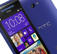
Like the glory days of the Dot-Com boom, the days of Daytona & Chicago, these will be days of learning and technical renovation, even re-invention. This is what I see coming with Windows 8 in the desktop, with an added benefit of being even more ubiquitous than it was back in the 90’s. With the coming of Surface, Windows Phone 8, your apps will have more opportunity to run in more places, on more machines, than ever before…. using more “Star Trek” functionality than we’re yet used to.
Those looking to remodel that kitchen… here’s your wake up call. Windows 8’s user experience is representative of what made the Dot Com days so great… (and there were some plus sides.) It was when leveraging any of the revolutionary new technology became a competitive advantage all by itself. Early adopters will feel the pinch of the initial investment, but… with some planning, will reap the rewards by having that pain behind them by the time Windows 9 rolls around.
I, for one, look forward to my new OS overlord.
